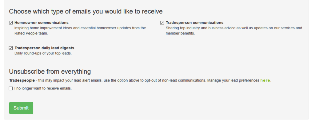
Update 15/1/21: We have had to take back the award as they have updated there unsubscribe page! (I am pretty sure they will be OK about that!). This shows they respond to emails in a positive manner and the chain of command in a complaint gets to the correct people. Well done Rated People.
There updated unsubscribe page appears at the very bottom of this post.
We all need to unsubscribe at some time but when companies make it really hard to do this, it becomes annoying and a big waste of time. They do not think about the older generation, or people that do not know technology, or people with disabilities.
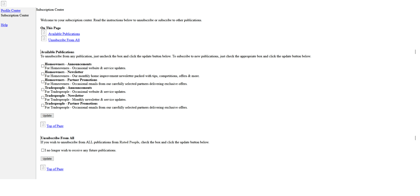
The screen shots below are from RATED PEOPLE https://www.ratedpeople.com/

1. It shows no thought as it is too complex to understand what to do.
2. Tick boxes too small.
3. Font way too small.
4. Not following guidelines of the GDPR which clearly states the following: –
- Your message must include a clear and conspicuous explanation of how the recipient can opt out of getting email from you in the future.
- Craft the notice in a way that’s easy for an ordinary person to recognise, read, and understand.
- Creative use of type size and colour.
- You may create a menu to allow a recipient to opt out of certain types of messages, but you must include the option to stop all commercial messages from you.

Imagine the problem seeing this on a mobile!
If you know an unsubscribe form that is worse than this let us know!
Updated Unsubscribe Page


