

A simple way to show a highlighted Contact button of your choice, that is part of your navigation drop down only when it becomes responsive in mobile.
I am using Elementor (WordPress plugin).
Desktop view

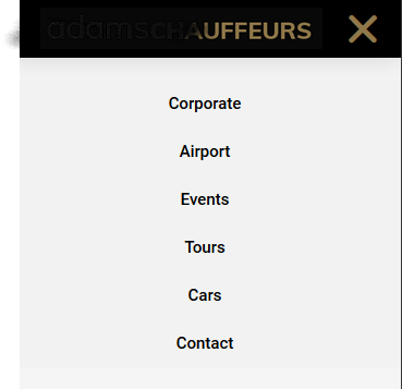
Mobile view
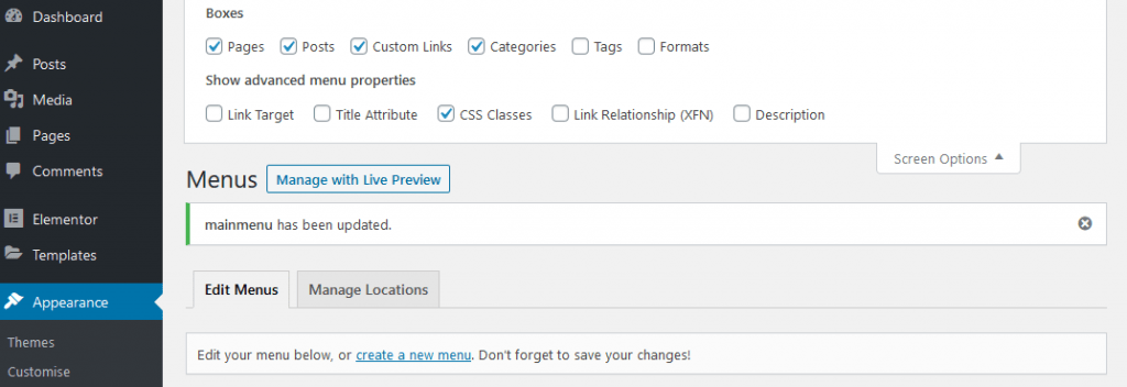
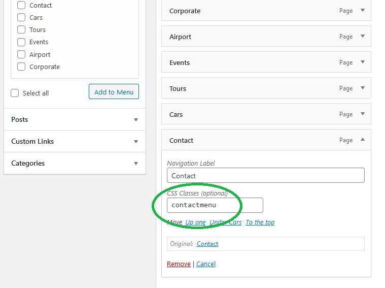
Enable classes in your menu
Step 1:
Add a class to the contact button in the menu area called .contactmenu
Step 2:
Step 2:
Add the CSS to your style sheet
.contactmenu {

		display: none !important;

	     }

@media (max-width: 767px) {

	.contactmenu {

			display: block !important;

	}

}
Step 3
Test this – your menu item ‘contact’ will now appear in your mobile view, but not in your desktop view as its hidden by css.
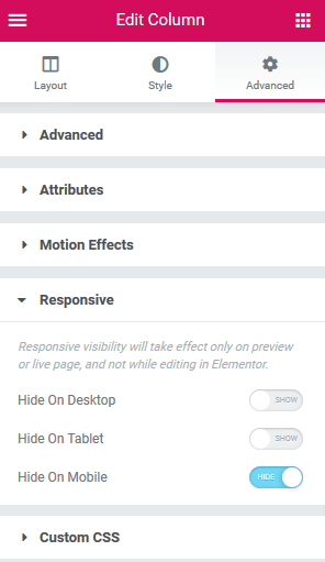
Step 4
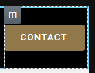
Add any button of your choice to the desktop view (in this case a contact button) and make sure that it is hidden when in mobile view.
Summary: –
The button will SHOW in Desktop but be HIDDEN in Mobile version
The menu item called ‘Contact’ will be HIDDEN in desktop by CSS but SHOW in mobile version.